Website · Creative agency
JSTRS
A creative agency's website, built from their own Figma design.
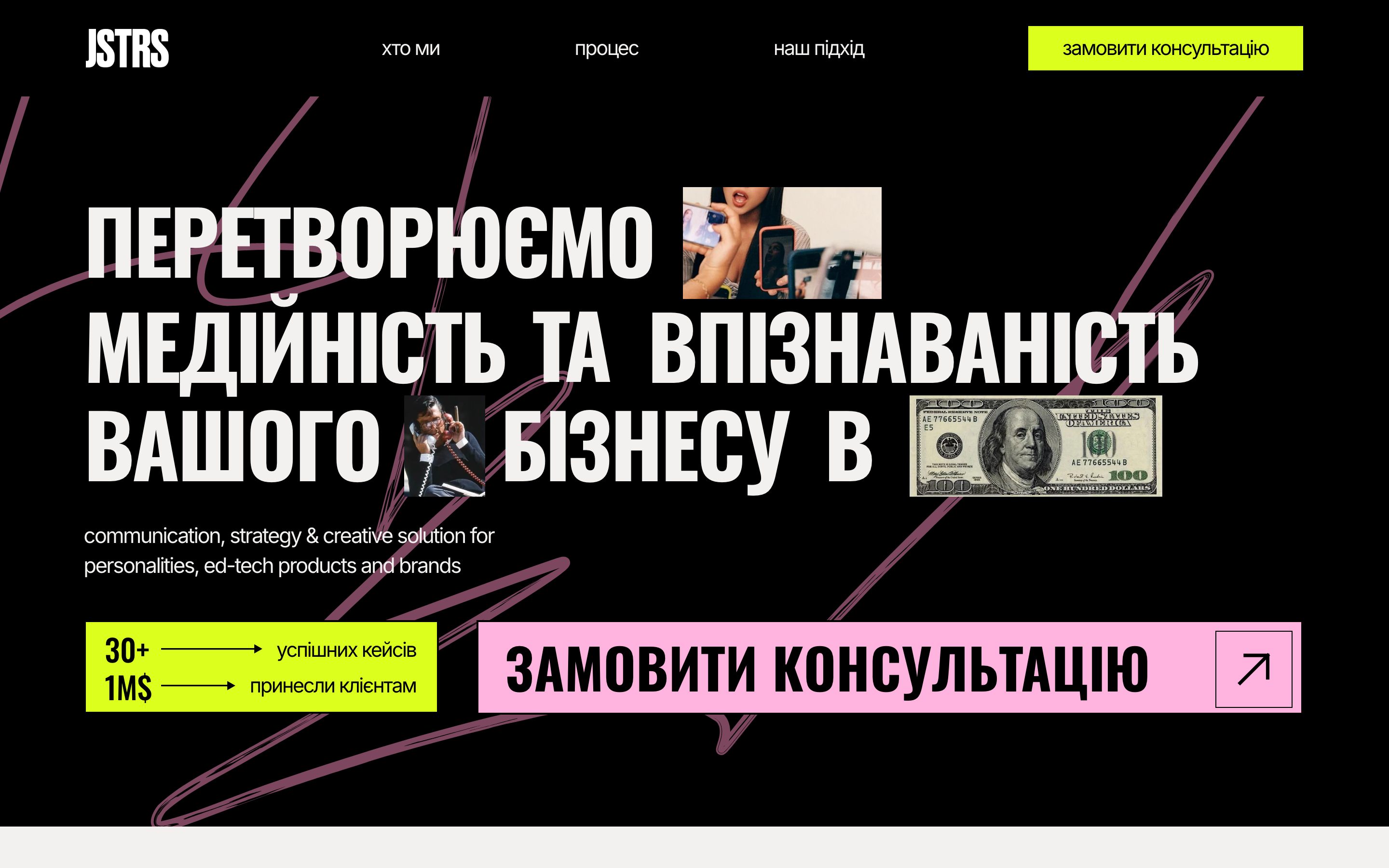
Role Website development from the client's Figma design.
JSTRS is a creative agency that plans content and social media for brands, businesses and personalities. They came with a finished design in Figma: loud type, stickers, photos tucked between words. We built it as a working website that looks the way they drew it on a laptop and on a phone, moves as you scroll, and sends every enquiry to their inbox.
- Language
- Ukrainian
- Design
- The agency's own, in Figma
- Pages
- Home, contact form and thank-you page
- Enquiries
- Sent to the agency's email inbox
01
Building the design as it was drawn
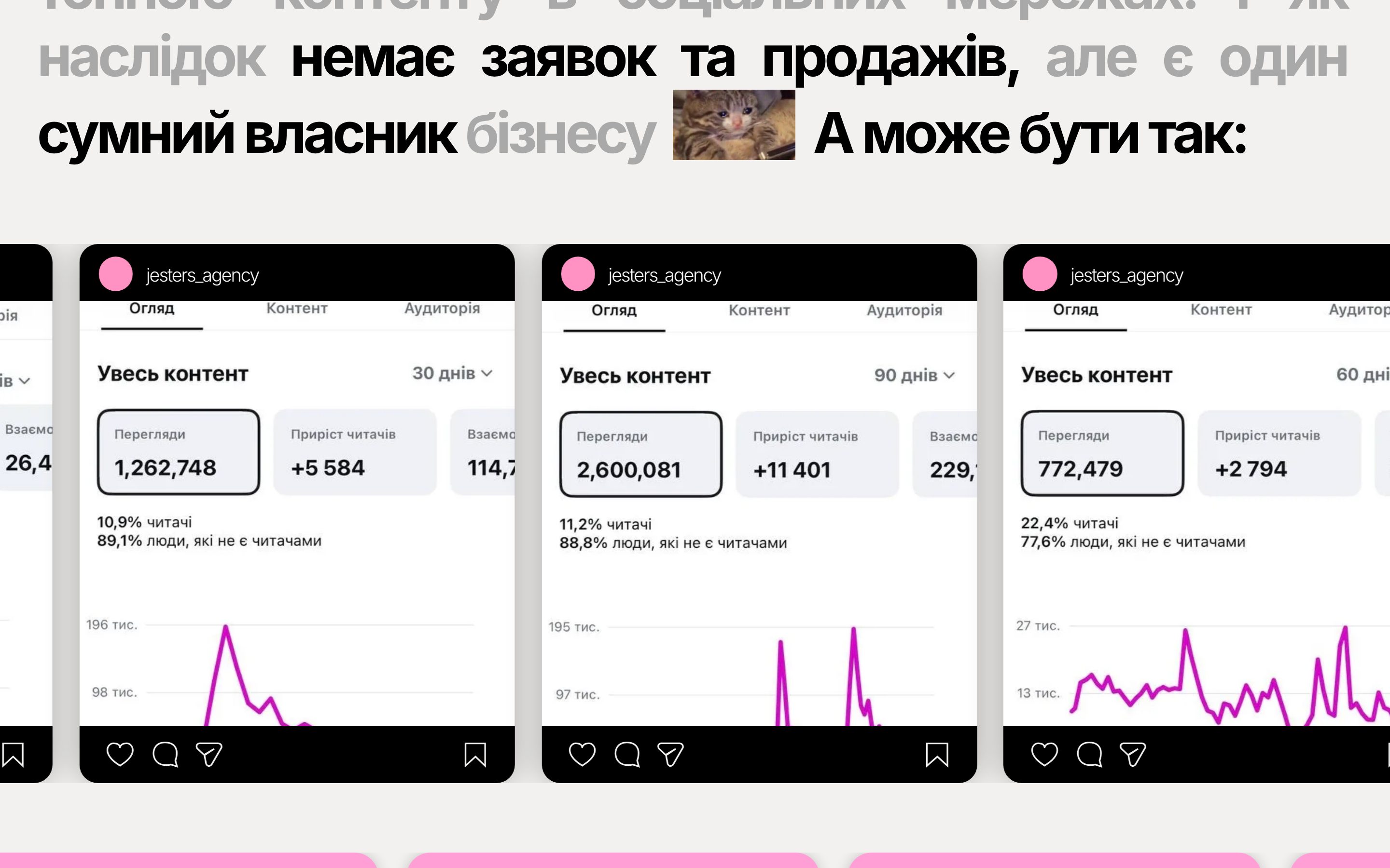
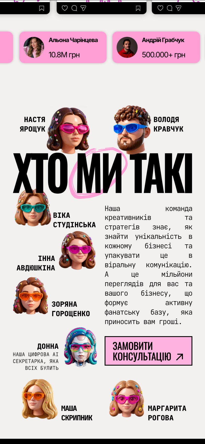
The Figma file had a desktop and a phone version of every section. We compared the built pages with those frames side by side at both sizes, down to the type, the spacing and where each sticker sits, and fixed the differences until they matched.

02
Motion that follows the story
The agency's pitch is a path from the first meeting to results, so the page tells it that way. A dotted line draws itself between the steps as you scroll, and headlines arrive line by line. People who ask their device for less motion get the same page, still.


03
Every visit can become an enquiry
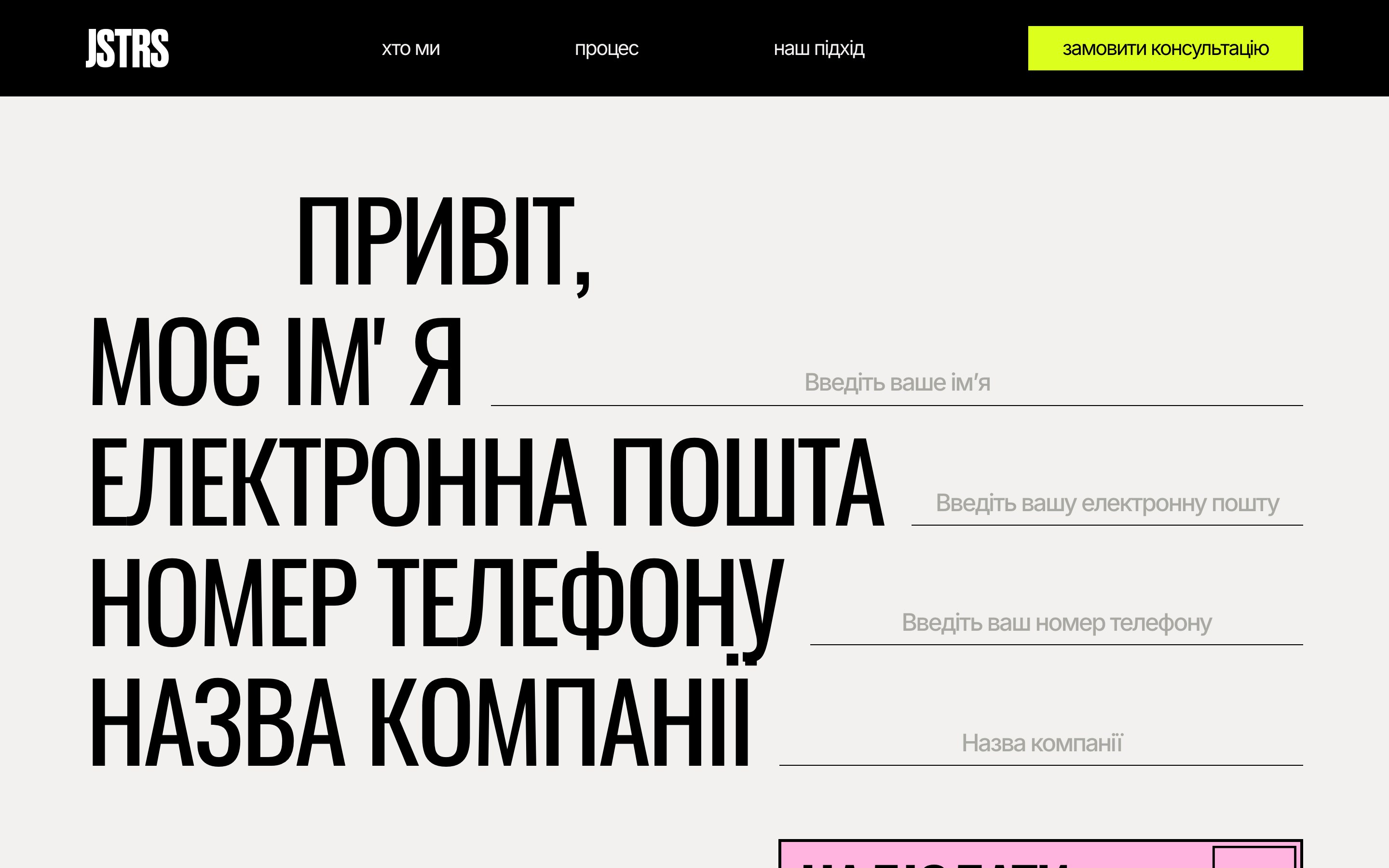
The pink button to book a consultation comes back all the way down the page. The contact form asks for four things, reads like a sentence and sends the enquiry straight to the agency's inbox, and a visitor's details stay in the form if the sending fails. Visits and enquiries are counted in the agency's analytics and advertising accounts, so they can see which campaigns bring people in.

What we delivered.
A Ukrainian-language agency website that matches its Figma design on laptops and phones, tells the agency's process as you scroll, and turns visits into enquiries that arrive by email and are counted in their analytics.
The JSTRS brand, design, photography and content belong to JSTRS.
Build details
- Design check
- Compared with the Figma frames at desktop and phone sizes
- Motion
- Plays as you scroll, and stays still for people who turn motion off
- Phone speed
- Main content in 1.4 s on a slowed-down phone test